NutritionNow
Mobile App Design and Prototype using the UCD process
The Story
As part of my User Centered Design certificate coursework, my team designed and prototyped a mobile application for managing food nutrition. It aimed to streamline the meal recording process and promote healthy meal decisions by reducing the negative emotional association with dieting. Our goal was to encourage a long-term behavior change towards healthier nutrition habits, culminating in the obviating of the app itself. We shared the roles of project management, ideation, and design, with visual design falling mainly on one of the other team members with a visual design background.
UX Design Process
+----------+   +-------------+   +--------+   +-----------+
| Ideation +---> User Survey +---> Design +---> Prototype |
+----------+   +-------------+   +---^----+   +-----+-----+
                                     |              |
                                     |        +-----\/---+
                                     +--------+ Evaluate |
                                              +----------+
- Ideation
- User Survey
- Design
- Prototype
- Evaluate
- Iterate
Ideation
The nutrition tracking experience is common among those we surveyed, but adherence was low. We considered both a mobile app and a countertop personal assistant. The ubiquitous presence of cell phones and user’s familiarity with nutrition-tracking apps won out.
User Survey
Our primary question was “Why did users stop tracking their nutrition?”
Results:
- Too time-consuming
- Too difficult to use
- Forgetfulness
- Unrewarding
- Met their goal
Design
We chose design principles to address each of the users' issues.
- Wizard-style dialogs with minimal number of steps clearly prompt user
- Image recognition of food elements most data entry
- Non-technical portion measurements simplify data entry (ie: “Was the portion bigger or smaller than your fist?")
- Meal-time notifications remind users when they normally eat
- Gradual increasing fidelity of portion questions prevents long time commitments when users are first establishing the habit of food tracking
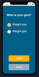
| Daily summary | Meal entry | |
|---|---|---|
 |
 |
Prototype
Invision Prototype (Currently unavailable - see Design Specification for screenshots and user flows)
Evaluate
Users responded to our prototype with questions about the status of their progress towards their goals. They also were confused by how little data the app was asking them to enter. We also received feedback that the conversational nature of the dialogs was not conveying enough information about status.
Challenges in the Design
How do you balance engagement with tedium? Nutrition tracking is at its a core a data-entry task and our survey results show many negative feelings around the process. Can you prompt novice users in a way that both teaches them to respond more accurately over time?
Artifacts
- Design Specification (includes full screen shots and user flows)
| Setup wizard | Reminder notification | |
|---|---|---|
 |
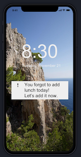 |
Reflection / Retrospective
I enjoyed working with my team mates, Mike and Sonam, because we all saw the potential of our project. My favorite part of this design is its humanity - it makes friendly a task that causes so much anxiety.
Our survey process went very well. Responses focused our design efforts on lifting the negative associations with nutrition tracking.
If I were to revisit this design, I would begin at a much lower fidelity prototype and iterate more often. Unfortunately this wasn’t possible given the time constraints and project goals.
I would also spend time validating the “progressive engagement” concept. I would like to find the answers to: How do you balance tedium and engagement in a data-entry task? How do you establish habits without nagging the user?